Devs for Devs: A Working App Is Only the Beginning

Happy Sunday! 👋 Today, Ekaterina Buyanova is sharing her secrets with us. She’s an iOS developer with a strong interest in SwiftUI, creative coding, and building polished user experiences. Ekaterina also shares her experiments and practical discoveries with the iOS community through technical posts and open-source projects. Where would the indie app development process go? P.S. You can check out Ekaterina’s work on LinkedIn, and Git.
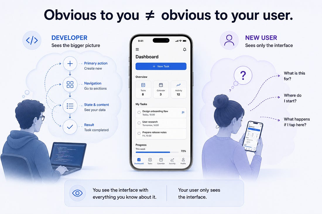
Subscribe if you’re new here! 👋 I’ve come across many technically impressive apps. Complex features are implemented exceptionally well, the problems they solve are genuinely meaningful, and some solutions clearly reflect serious engineering work. The developer understands the system inside out and can bring almost any idea to life. To the person who built it, the interface feels obvious - they know its logic, understand the purpose of every element, and remember exactly where each action is. A new user arrives without any of that context. They open the app for the first time and see only what’s right in front of them. At that point, the technical complexity behind the product takes a back seat. If users have to search for the primary action, figure out the navigation, or guess what they’re supposed to do next, there’s a good chance they’ll simply close the app. Not because the product is bad or the feature isn’t useful, but because the cost of that first interaction was higher than the value they had a chance to see. While working on my own product, I started looking at development more and more from this perspective. A working feature doesn’t automatically create a good user experience, and a technically finished app isn’t necessarily a finished product. The First Few Seconds MatterA user forms their first impression of an app before they have a chance to appreciate its functionality. First, they need to understand something much simpler: where they are, what they can do, and where to start. And this is where developers face a problem - we know our own interfaces too well. After dozens of hours working on an app, the meaning of every icon and the location of every button feel obvious. But that knowledge exists in the developer’s head, not the user’s.
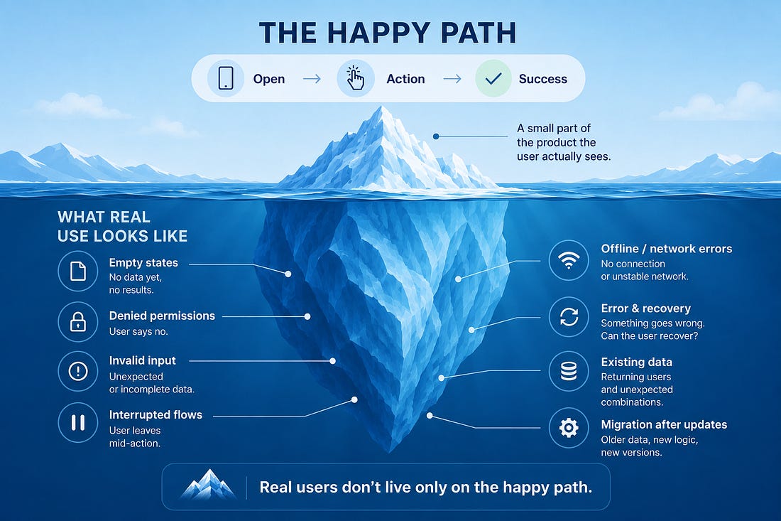
That’s why a working interface isn’t necessarily an understandable one. A button can trigger the right action, data can save correctly, and navigation can work without errors - while the user is still looking at the screen wondering, “What am I supposed to do next?” One thing worth paying close attention to is visual hierarchy. If five elements on a screen all look equally important, we’re essentially asking the user to decide what matters most. The primary action should be easy to recognize, while secondary options should appear when they become relevant. The same applies to familiar iOS patterns. It can be tempting to invent a more original interaction, but navigation bars, sheets, tab bars, and system controls already have one major advantage: users know how they work before they even open our app. If a standard pattern solves the problem well, there should be a good reason to replace it with something unfamiliar. One of the most revealing tests requires almost no tools at all. Give the app to someone who has never seen it before, ask them to complete a specific task, and don’t explain anything. The moment you feel the urge to say, “No, tap here first,” stop. You’ve probably just found a part of the interface that was obvious to the developer - but not to the user. That’s why testing shouldn’t focus only on whether a user can complete an action, but also on whether they can figure out how to do it on their own. Beyond the Happy PathDuring development, it’s easy to focus on the ideal scenario: the user opens a screen, performs an action, and gets the expected result. But real users don’t follow our test scenarios. They leave fields empty, interrupt actions halfway through, lose their connection, or return to the app after an update with existing data. Sometimes they simply use a feature in a way we never expected. This is where the difference between a working feature and a resilient product becomes much more visible. The happy path is only the tip of the iceberg.
Below the surface are all the states that are easy to overlook when everything goes according to plan: empty states, denied permissions, invalid input, interrupted flows, errors and recovery, migrations, and unexpected combinations of existing data. So when testing a feature, it can be useful to reverse the usual question. Instead of asking only: “Does the main flow work?” ask: “What happens when the user goes beyond it?” The happy path shows that a feature works. What happens around it shows how well the product was actually designed. More Than Working CodeWhen building your own app, it’s easy to focus on the question we, as developers, naturally ask: “Does it work?” It’s an important question - but for an indie developer, it can’t be the last one. There may be no separate designer, QA engineer, or product team to challenge our decisions from another perspective. We have to deliberately step outside the implementation and look at the experience we’ve created. The code can work perfectly. But users don’t experience the implementation - they experience the product. And that’s why a working app is only the beginning. WaterMeApp 🌿I recently released WaterMeApp, an iOS app designed to make everyday plant care simple and easy to keep track of. I wanted the experience to feel calm and intuitive, with a thoughtfully designed interface and a soft, nature-inspired color palette. One of the features I especially wanted to include was shared plant care - you can share your plants with someone while you’re away and stay updated when they’re watered. Building WaterMeApp gave me the opportunity to put many of the ideas from this article into practice - and reinforced the idea that making an app work is only one part of building a product.
Subscribe if you’re new here! 👋 Every Wednesday news, every Sunday tips from devs!
|